
PHONEPE PULSE DATA ANALYSIS
OBJECTIVE
Extract data from PhonePe GitHub repository, transfer data to SQL and visualize it using Streamlit.
Quick Links :-
Tools Used :-
Pandas, Streamlit, Matplotlib, Plotly
INTRODUCTION
PhonePe is an Indian digital payments and financial services company headquartered in Bengaluru, Karnataka, India. PhonePe was founded in December 2015, by Sameer Nigam, Rahul Chari and Burzin Engineer. The PhonePe app, based on the Unified Payments Interface, went live in August 2016.
Why this Dataset:- This is a real-world dataset that is updated in GitHub every 3 months. Currently, the data is from 2018 - 2023. Phonepe Website has a great visualization which mainly excited me to make this project.
Also, I wanted to explore this domain and analyse the data to see patterns.
Overall Goal:- Visualize and analyze patterns of transaction, Users and insurance based on state, district, year and quarter..
EXTRACTION
The JSON file is then traversed to fetch the data and put in a CSV file and also insert into SQL tables.
All the files in the repository are JSON files and the files are organised in the following way:

EXPLORATION
Through exploring the data we can see that instead of collecting the data from separate years folder, we can go through the individual states folder and get state wise data as using aggregate queries in SQL we can get the total.
Also the data is divided into 3 types:
-
TRANSACTION
-
USERS
-
INSURANCE
VISUALIZATION
The data is then visualized using the geo-visualization library in plotly. Also, some key insights are stated on its side.

Geo Visualization of
the data using Plotly where the color represents the intensity of the values.


Overview of the total data with top 10 states, districts and pincodes
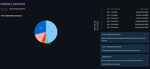
INSURANCE DATA


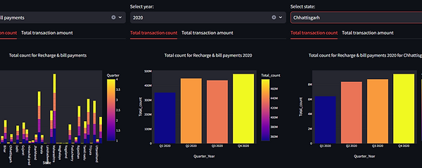
TRANSACTION DATA
USERS DATA
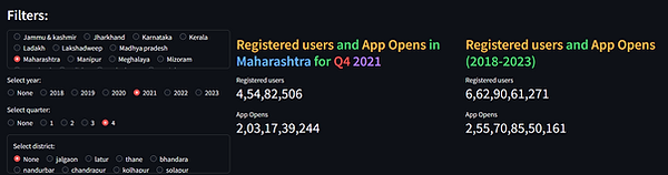
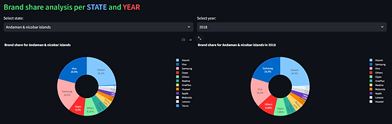
WHAT I LEARNED
Extract data from JSON file.
Insert data from JSON to SQL format.
Geo Visualisation of the data using Plotly.
Analysis of Data using Plotly charts.